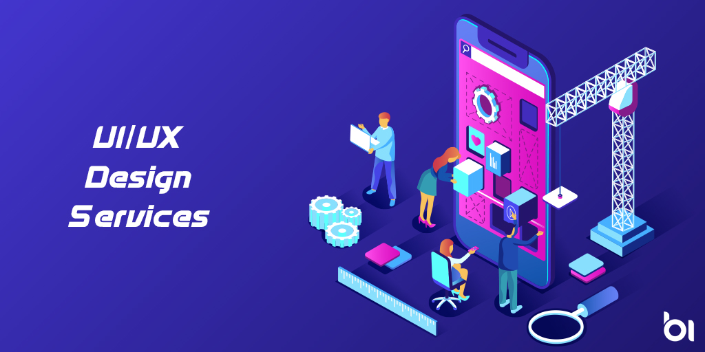
The process of creating a great design is abundant with various nuances, just like every other stage of software development cycle. Great design is always built around the functionality. It serves for a user as a means of getting to a certain feature or content a) as soon as possible, b) in the most convenient way, c) without any excessive screens or gestures. Then design gains colors and the overall aesthetic filling, which defines the final result.
These app design tips are based on experience, and have proved useful for software designers. But it’s as well worth being read by their clients – software product owners. Knowing these nuances is helpful to better understand the project, the users, and how the application is going to work. Furthermore, it gives a chance to avoid many mistakes, to give the design a good start.
1) Design itself is not the purpose. The purpose is to provide the user with the best way of solving a peculiar task, with minimum time and attention required.
2) Minimalistic design is widely appreciated: it doesn’t distract, it’s easier to understand, it allows users to concentrate on the functional, practical use of the app.
3) When an average user gets acquainted with an app, the first thing checked is how consistently it works, how easy the navigation is.
4) Each icon/button has a direct functional meaning. But it’s always good when it’s beautifully, attractively designed.
5) If you have, for example, one icon/button on a screen, users will definitely pay attention to its design. If there’s an overuse, the design of each icon is likely to be lost in the whole colorful picture.
6) While smartphone screens are small, crowding buttons for the sake of reducing the number of screens may be lethal.
7) There is always a main button with main feature, used in the first place, the one most frequently tapped. This button should be placed at the bottom of the screen, where a thumb can easily reach it.
8) Thumb is the finger that’s used for one-handed tapping. Design must mean convenience for that. That’s essential for people who use their smartphone with just one hand, while the other holds a cup of coffee, a briefcase, a remote control, whatever.
9) For many people, there’s no time to appreciate pictures on the background or a special shape of buttons. All this, along with color palette, can serve just as a tasty addition by the first impression.
10) Users tend to spend a small amount of time within the application. Details are often skipped. The same can happen to the features that aren’t obviously shown. That’s because we use apps on the go, and there are so many things around, that also require our attention, so we take a brief look at the screen, then concentrate on something else, and so on.
11) Of course, some apps are designed to hold attention for more than several minutes at a time. Tablet games and book readers are the most obvious examples. But still, they have to be catchy and intuitive as well, for the sake of initial interest.
12) Smartphone games are usually a pastime that rarely lasts longer than several minutes. The abovementioned initial interest must be instantly awoken.
13) App loyalty is a very unstable thing. Remember that gaining users, which can be hard, is nevertheless much easier than retaining. A user may download 15 apps during a month, but you can’t say whether they will be used more than once.
14) Multitouch gestures reduce convenience, so they shouldn’t be used for basic actions. For example, instead of pinching with two fingers for zooming, users would prefer to tap twice with just one. Users always prefer standard, natural gestures, performed with one finger.
15) Designer will also help you with the ideas for visual hints (such as animations) for users, to show that some control bar requires sliding or scrolling.
16) Reduce scrolling where possible. Users may simply not pay attention to important features and content.
17) The app should be usable at an arm-length distance between the eyes and the screen.
18) Content buttons are usually placed at the top of the screen.
19) Apps, which demand intensive tapping (for example, productivity apps, such as planners), usually have control bars at the bottom of the screen.
20) Full-width controls (if possible) are good for both right-handed and left-handed people.
21) Finger is no stylus. Fingers are way blunter and hits aren’t that precise. Minuscule buttons, which are hard to hit, may be the sad reason to reject the whole app. Plan the ergonomics carefully. If your design can’t do without a small button, you may make the invisible hit area bigger than the button’s visual limits.
22) Another problem is lack of space between buttons. Don’t leave a possibility of hitting the wrong button. It messes things up even more, like accidentally tapping ‘delete’ instead of ‘save’. Users won’t like that.
23) Texts must be concise and precise.
24) If your app has a default analogue, you obviously take a look at the design. Users always seek for alternatives to the default apps, more sophisticated, functional, or specialized. But what you can safely do, is place the main controls the way they are by default. That’s not a bad thing – users won’t have to get used to a completely different system of controls. What’s also good – nothing will be confused in a hurry.
We at Progressio take care of these factors and effectively design a perfect app which shall be in allign with your business and shall create an everlasting impact on your customers converting them into leads. Already have an old App ?, Dont worry we also redesign your websites look and feel. Contact us now on how we can help redign your website. Book an free Appointment Here.